- Context: Collaboration with a web developer who creates and operates the web app Sportsdate.app.
- My role: Redesign of the UX and UI concept and interface, potentially of the entire app.
- My tools: Miro, Figma, VS Code
- UI component framework: Ionic
- Time frame: February – October 2024
Table of contents
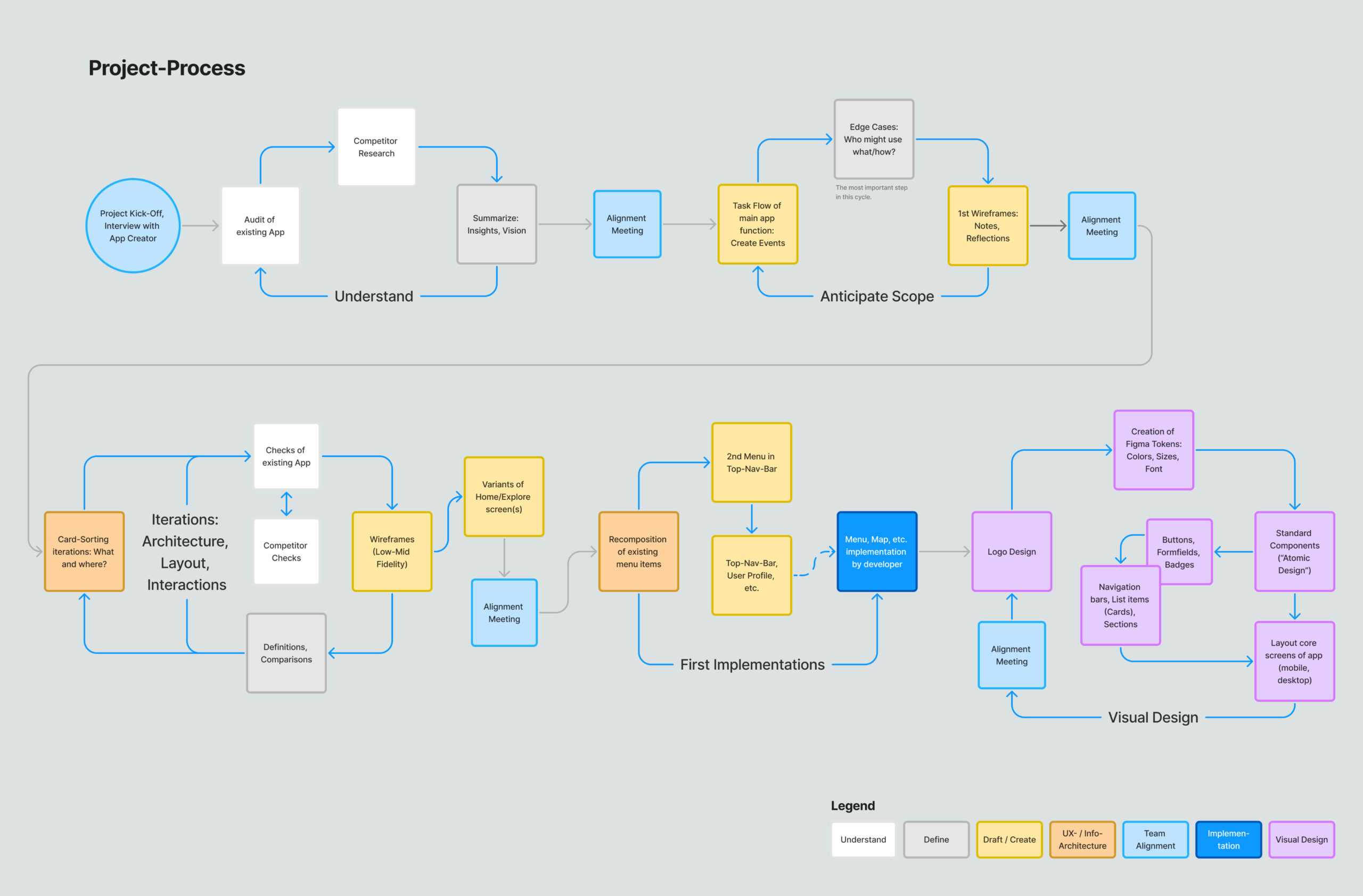
- 1. Understand the subject: What is the status quo of the app? What can we learn from competitors?
- 2. Anticipating the scope: Define differnt kinds of edge-use-cases and sketch out first Ideas in Wireframes and Task-Flows.
- 3. Between abstract and detailed: Iterations of App-Architecture, Wireframes and User-Interactions.
- 4. First implementations: Menu navigation restructured
- 5. Visual design: Logo Redesign, Tokens: Color/Sizes, Higher-Fidelity Screens
- 6. Project conclusion: Wrap up, Learnings
1. Understand the Matter

1.1 Current state of the app
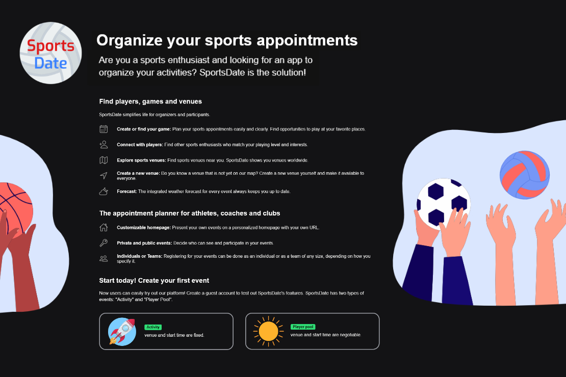
Sportsdate is a web app and PWA, organically growing in Berlin with a dedicated, albeit small, user community. Designed to better organize sports activities beyond social media limitations, it initially caters to beach volleyball fans but is intended for a diverse range of sports without boundaries.

Typical requests in related social media groups.
1.2 App audit
Based on an initial question-and-answer session about the founder’s motivations, pain points and visions, I created a comprehensive review of the app. The findings can be divided into two areas. 1. UX and UI basics and 2. more specific conceptual issues.
1.3 Learning from other apps
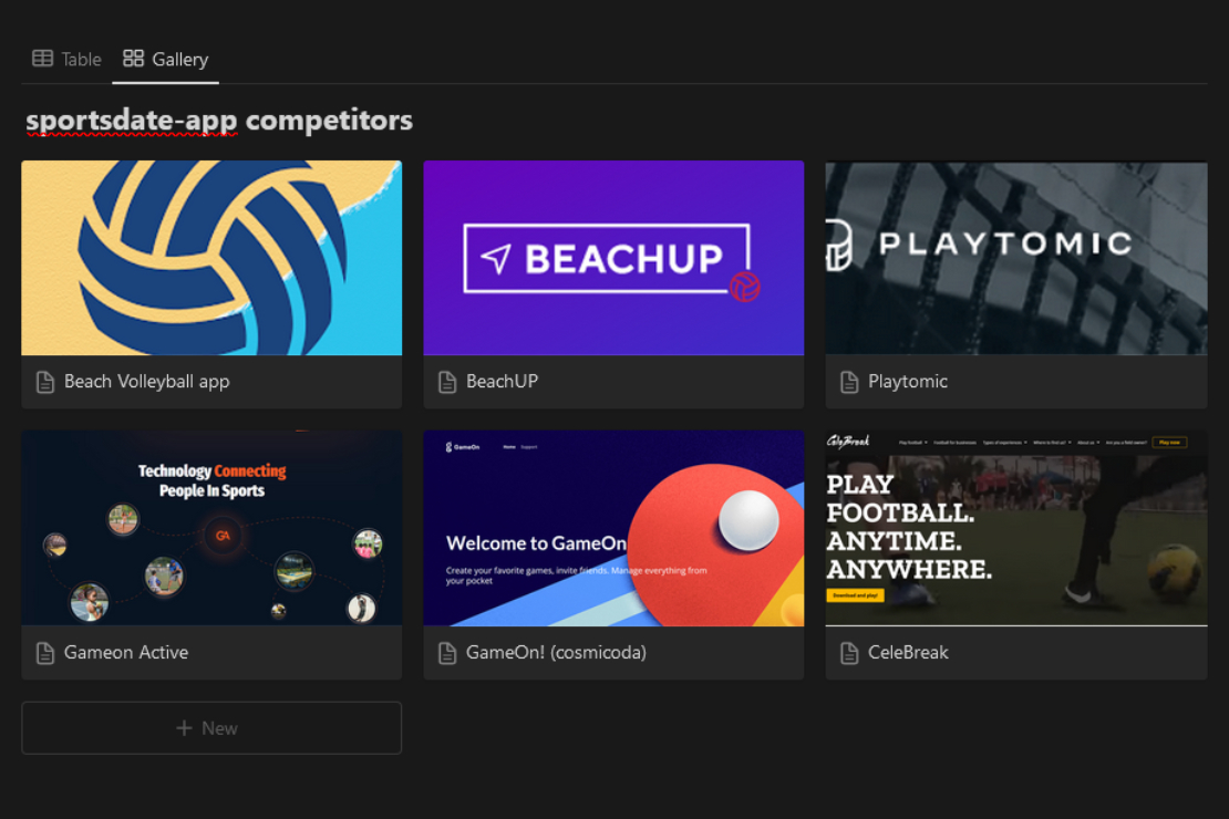
There are already apps that help people to organize themselves into groups for sport. Comprehensive research helps us to understand why we still need Sportsdate, what positive approaches we can learn from and where we can set ourselves apart.
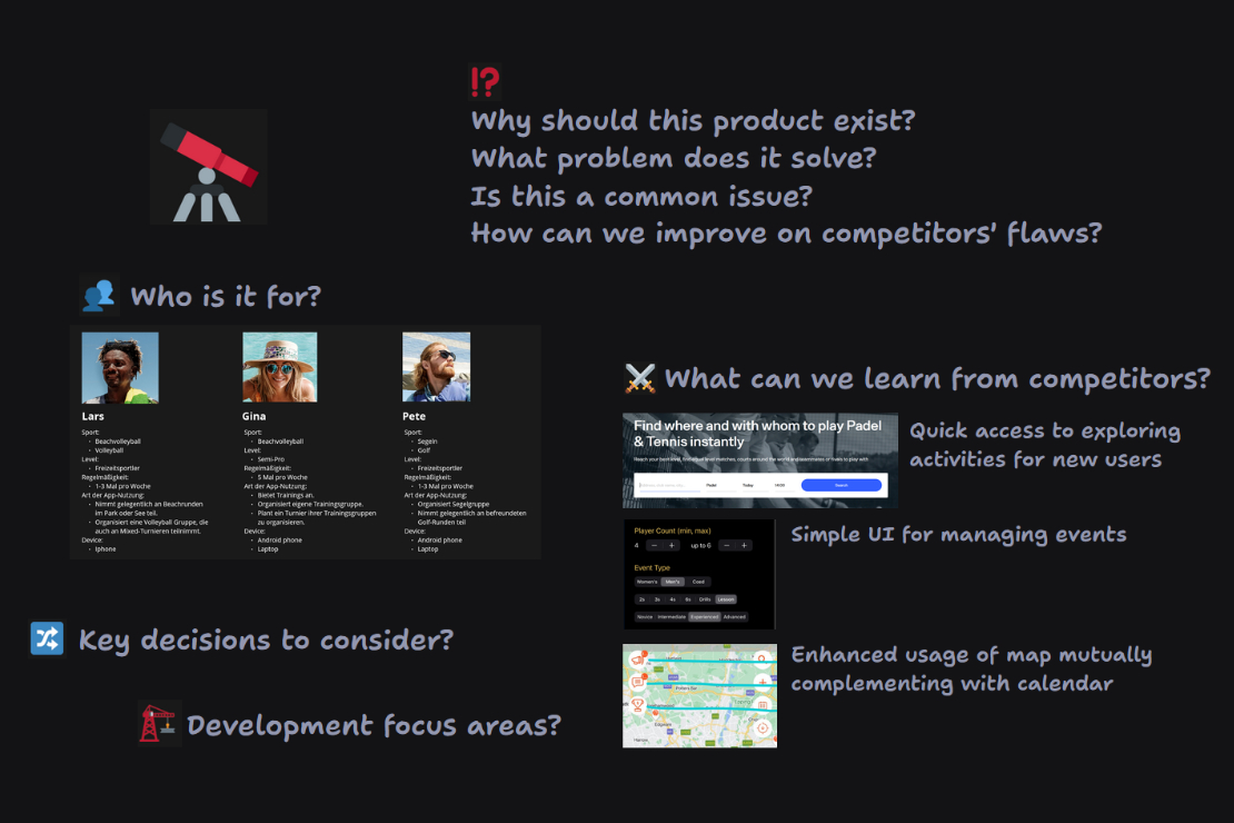
1.4 Findings and concept
2. Anticipate the Scope

2.1 Clear your head
2.2 Complexity of a user flow
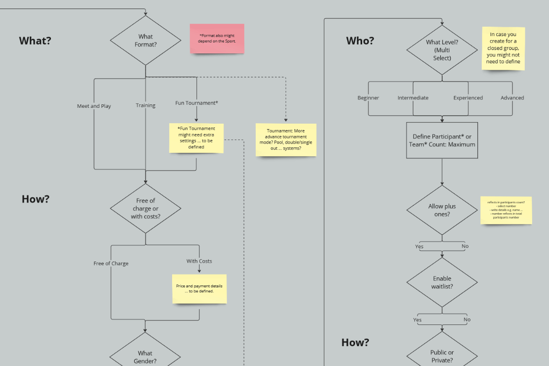
An initial hypothetical user flow diagram that describes the entire process of creating an activity in the app. In this step, I was more interested in understanding the possible complexity in order to shorten it later if necessary or to break it down into different flows.
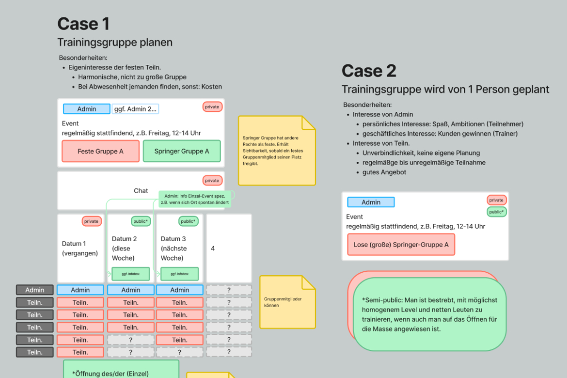
2.3 Edge cases of use
In the discussion so far, various use cases of the app have become visible, but these have not yet been described in detail, which should now be made up for. In addition, a schematic sketch of which UI components could represent the individual cases has been drawn up.
3. Between Abstract and Detailed

It is important to mention again at this point that a potential restructuring of the entire app, including the underlying information architecture and sitemap, is potentially desired.
In order to be able to make further design decisions, it was therefore important to think through the app holistically from a bird’s eye view and in detail.
3.1 Helicopter view
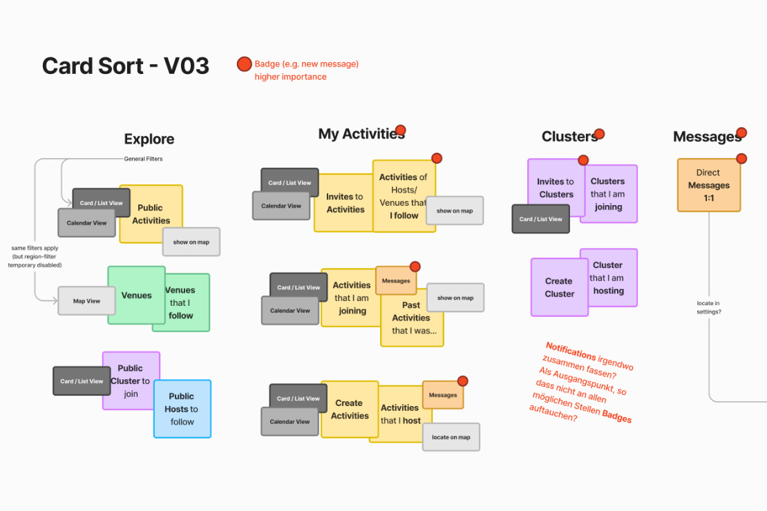
Once the range of functions has been outlined with the help of the edge cases, different variants of the info architecture can be compared with each other by sorting of named and color coded cards.
3.2 Understanding the small to question the large
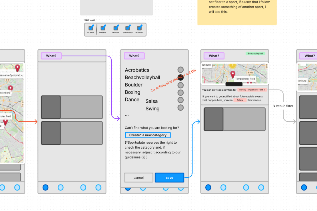
The certainty provided by the card sorting made sketching the first screens straight forward. The further you delved, aspects became visible, which in turn were reflected in the big picture.
3.3 Big decisions not made easy
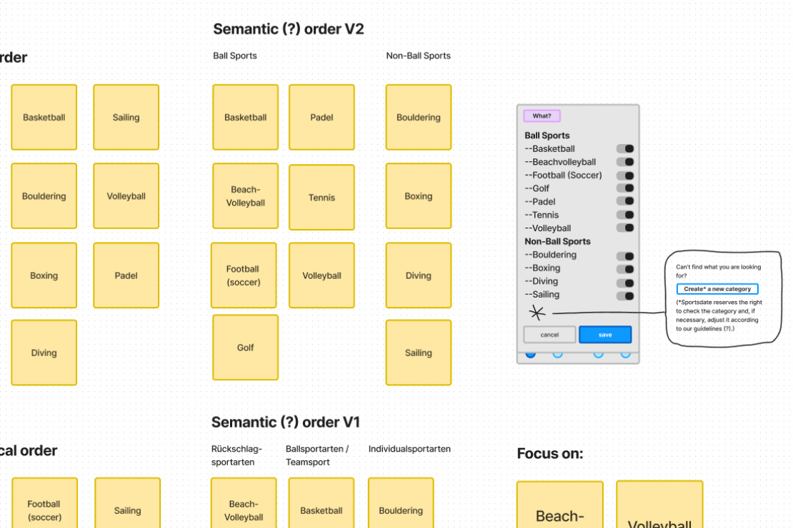
“Focusing the app on one sport would probably strengthen it, ...”
The sports categories currently offered in the app do not follow a specific scheme and have grown organically over the course of around five years. On the one hand, these are “merely” reflected in the filter options for activities and venues in the app – on the other hand, the user group, brand and identity of the app are based on the type of sport. Focusing the app on one sport would probably strengthen it, but this is not the developer’s current intention.
3.4 Mobile first
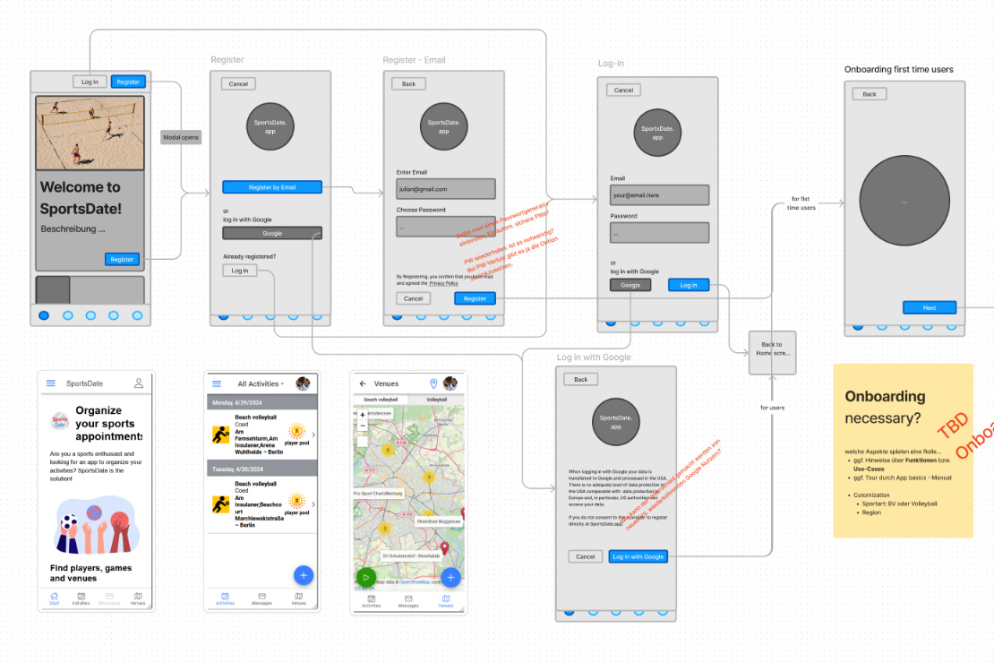
3.5 Visitor to user
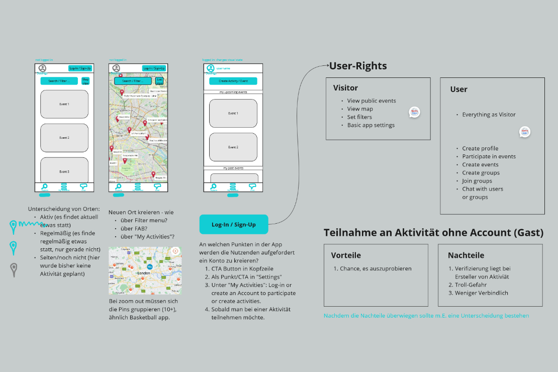
“How visitors can see and use the web app compared to registered users...”
3.6 How to read the map
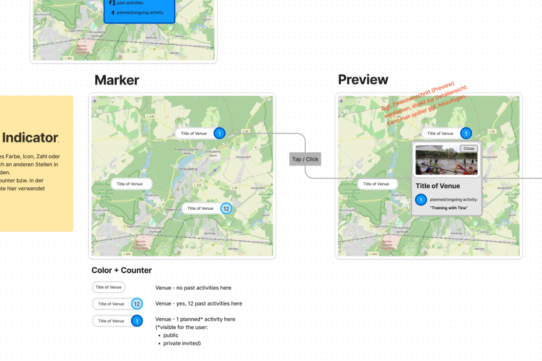
The app has a map whose locations users can discover, suggest or use to plan activities. The flag markers of the locations are intended to provide further information beyond the name at first glance, for example if a public event is planned there, or whether activities generally take place at the location more often.
“Again: Almost everything is connected - examine individual areas of the app down to the details, to understand the big picture.”
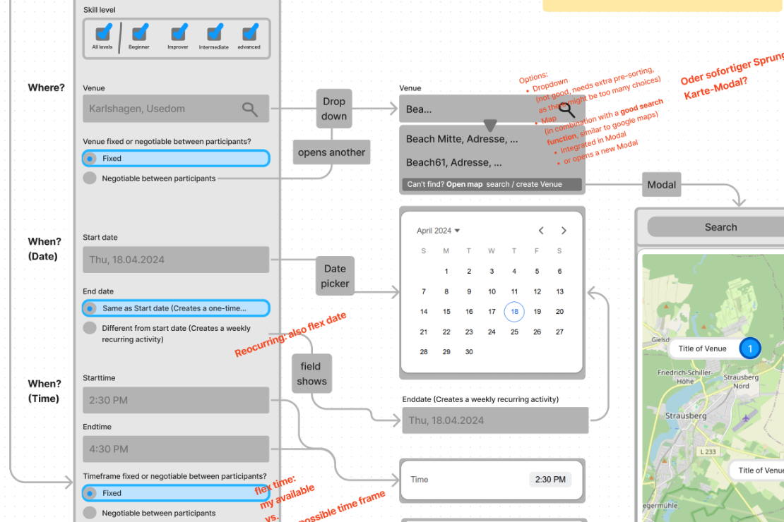
3.7 The core - the activities
The heart of the app is how events can be planned. The creation and participation management should offer users different options – the process should be as comprehensive as needed while remaining as simple as possible – depending on the individual use case and context. This topic will continue to require a great deal of attention during the further course.
3.8 A-B-C Variants
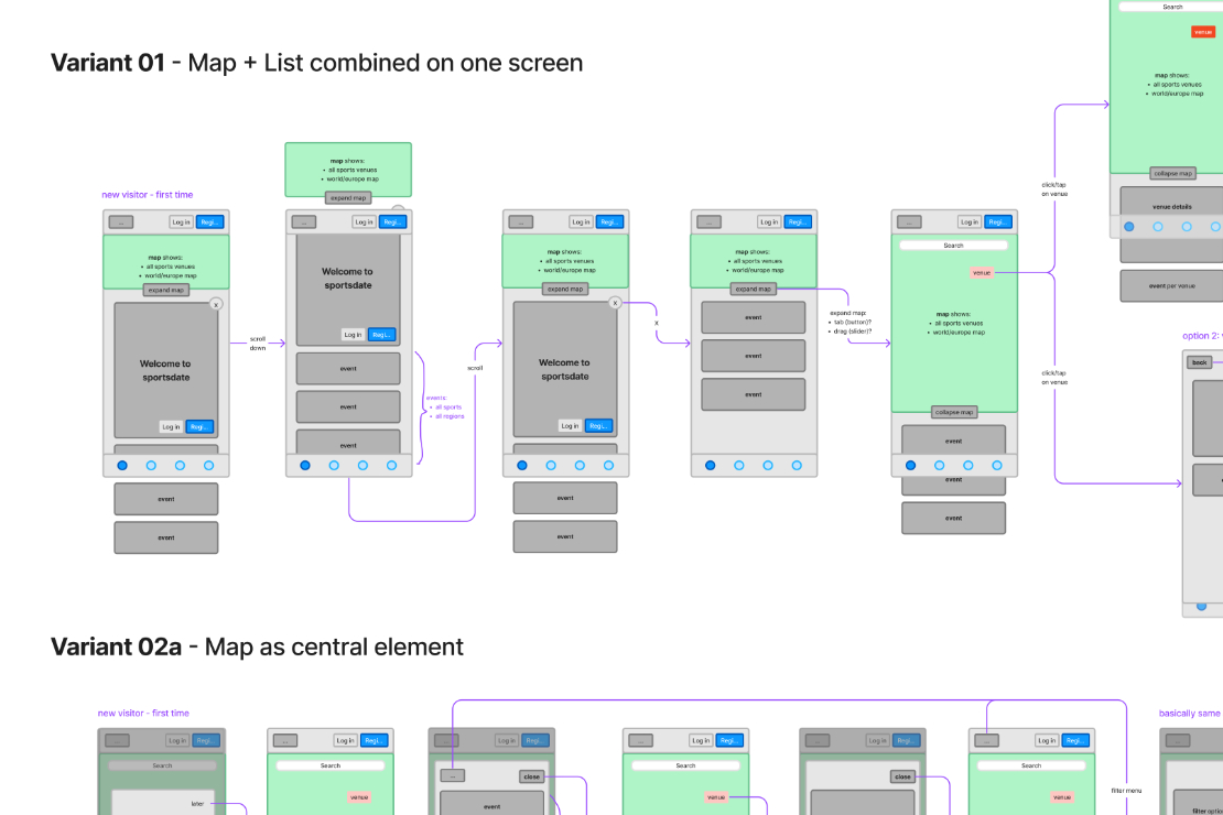
Some decisions should be made on the basis of a comparison of the possible options. The question here is how the different ways of exploring activities – map and list view – best interact with each other.
4. First Implementations

After working through and outlining a comprehensive vision of the app and its sub-areas in the previous phase, the next phase feels like a small step backwards.
However, it seems realistic to ‘tidy up’ the existing app for the time being and then ‘rebuild’ it piece by piece.
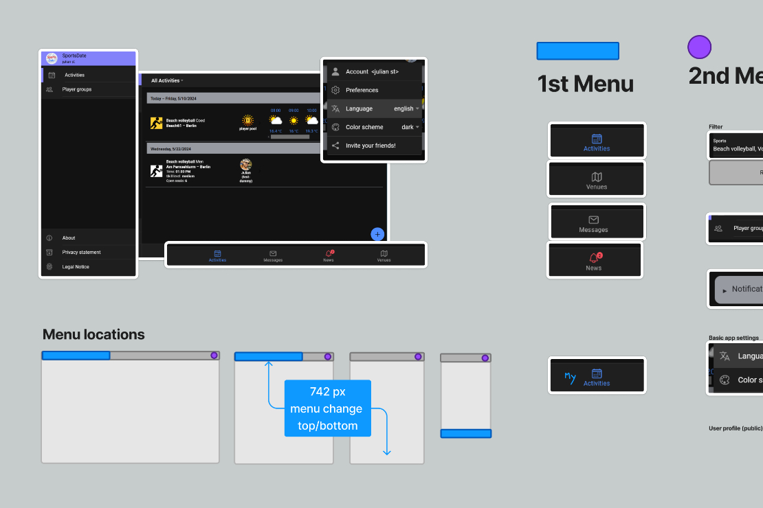
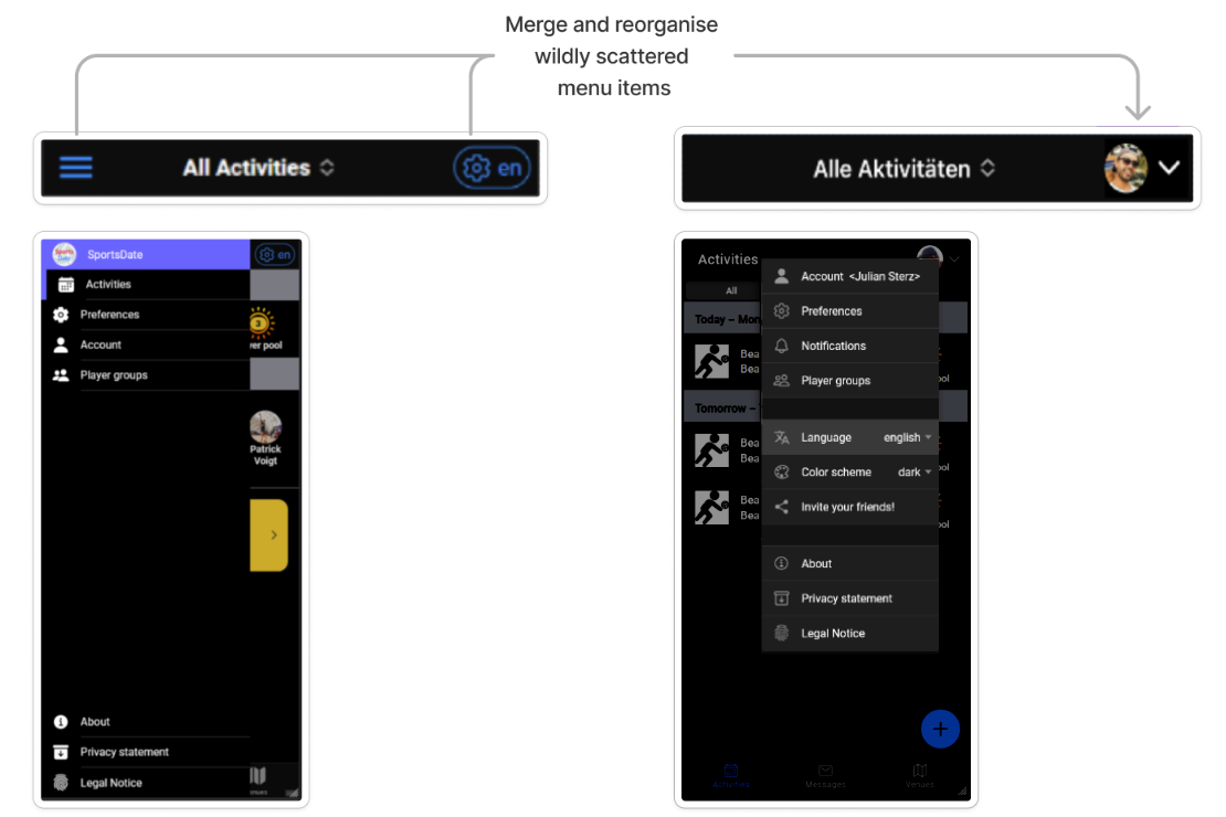
4.1 Menu navigation
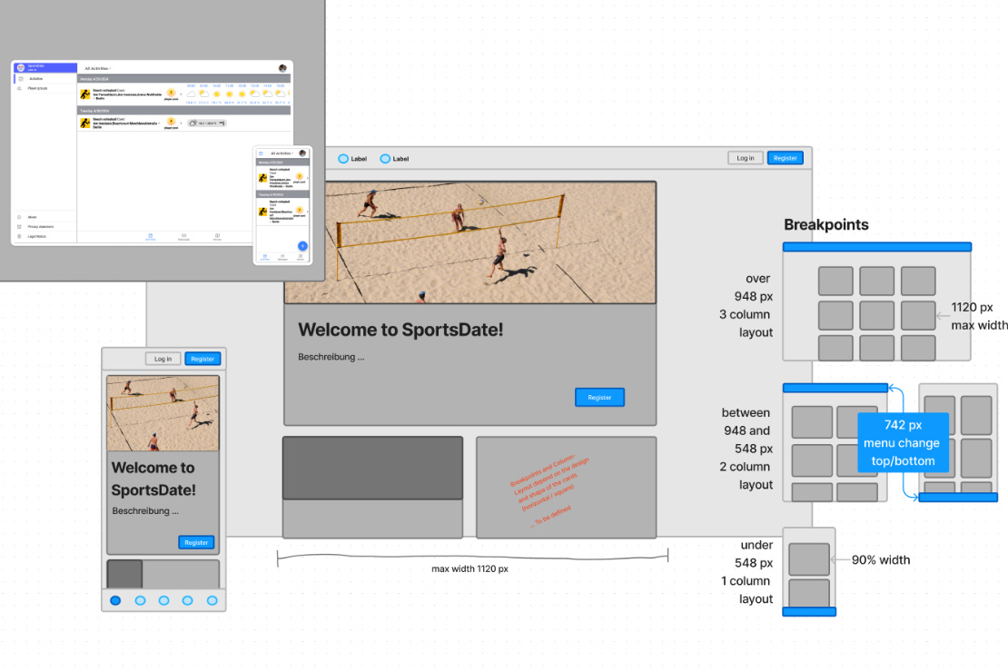
Working with screenshots of the existing app, taking it apart and reassembling it in a new form has proven to be particularly fruitful for mutual understanding with the developer.
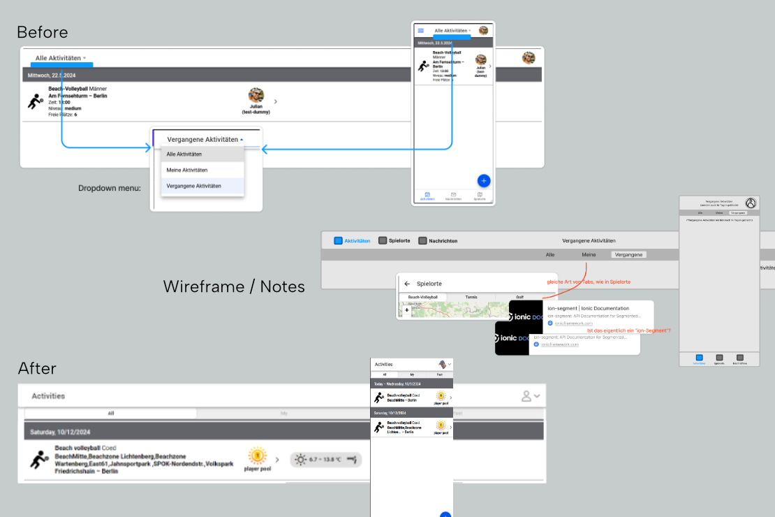
4.2 Top-Nav-Bar
To keep the navigation of the subpages consistent, the tab navigation was transferred from the map view to the main page of the activities.
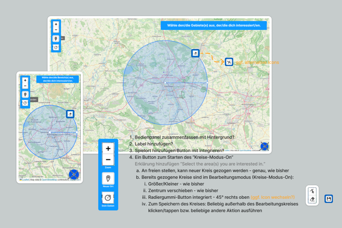
4.3 Set a "homezone" on the map
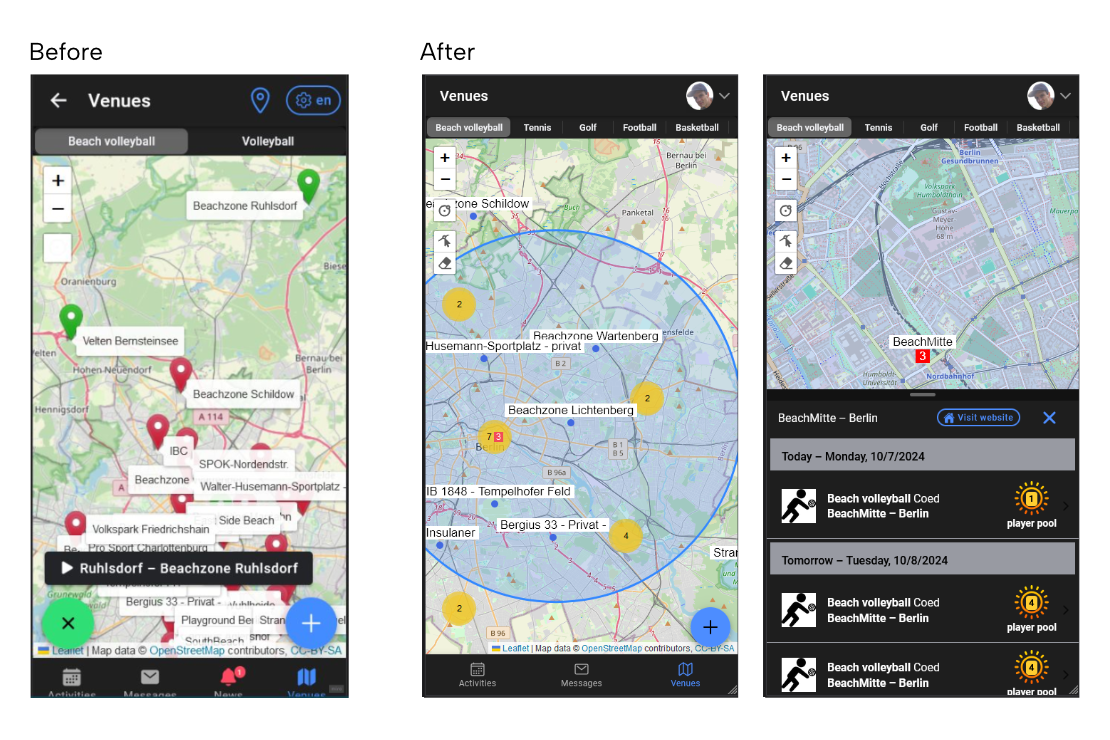
In its original state, the map view was confusing because of the many location labels. Users could “subscribe” to places in their area to be informed about activities taking place there – which was displayed in the form of red or green markers and proved to be an ambiguous coding.
After: The labels were reduced in size and summarized with a counter (zoom out). The user’s area of interest is clearly defined by circles. In addition, the detailed view modal of the venues now also directly shows the events taking place there.
4.5 Feedback and further improvement ideas
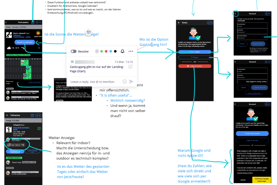
When looking at the implemented improvement of the user home zone filtering, ideas emerged for the gradual further development of the interface and the associated simplification for new users – as well as notes on the side effects that should be considered.
4.6 User profiles
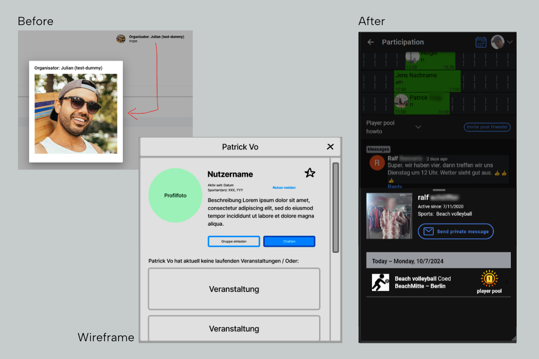
In the previous version of the app, there is an unusual concept of user profiles, in the form of so-called homepages, which users can optionally create and serve as a landing page for their profile.
This concept was questioned and partially implemented in such a way that all users have a profile with a minimal amount of information, which also displays the events created by the user according to the same scheme as the preview modal for venues.
5. Visual Design

The assets shown here in the last documented visual design phase were unfortunately not implemented in the current app in this form.
There hasn’t been enough time to delve deeply enough into the topic of HTML/CSS in connection with the existing IONIC components and their application in the current app, neither on my part nor on the part of the developer.
5.1 Logo redesign
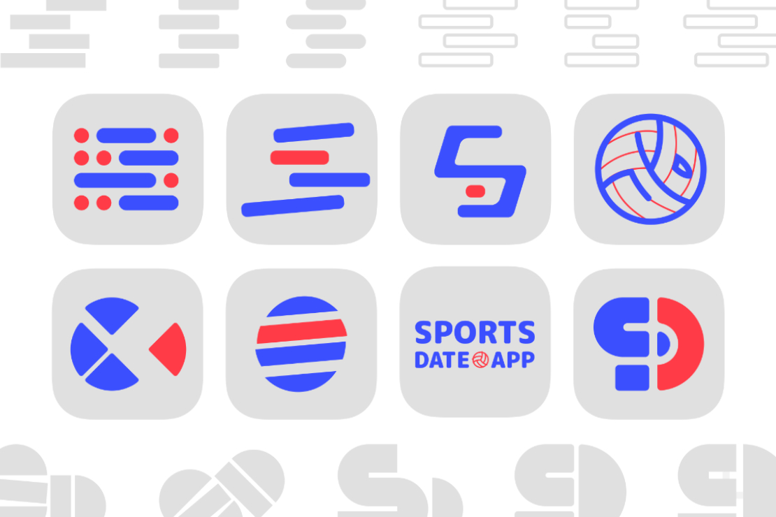
The idea was to redesign the current logo as part of the overall project. Because the further user interface design should be in harmony with the logo, we placed this step at the beginning – as a point of orientation – of this phase.
The following keywords were used as themes for the logo: sport, doing something together, modern technology, possibly a focus on (beach) volleyball and the name “Sportsdate.App”, which was still valid.
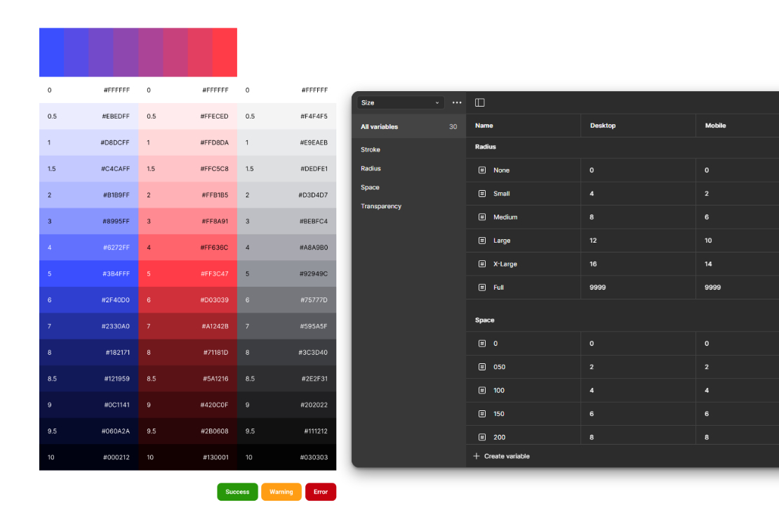
5.2 Tokens
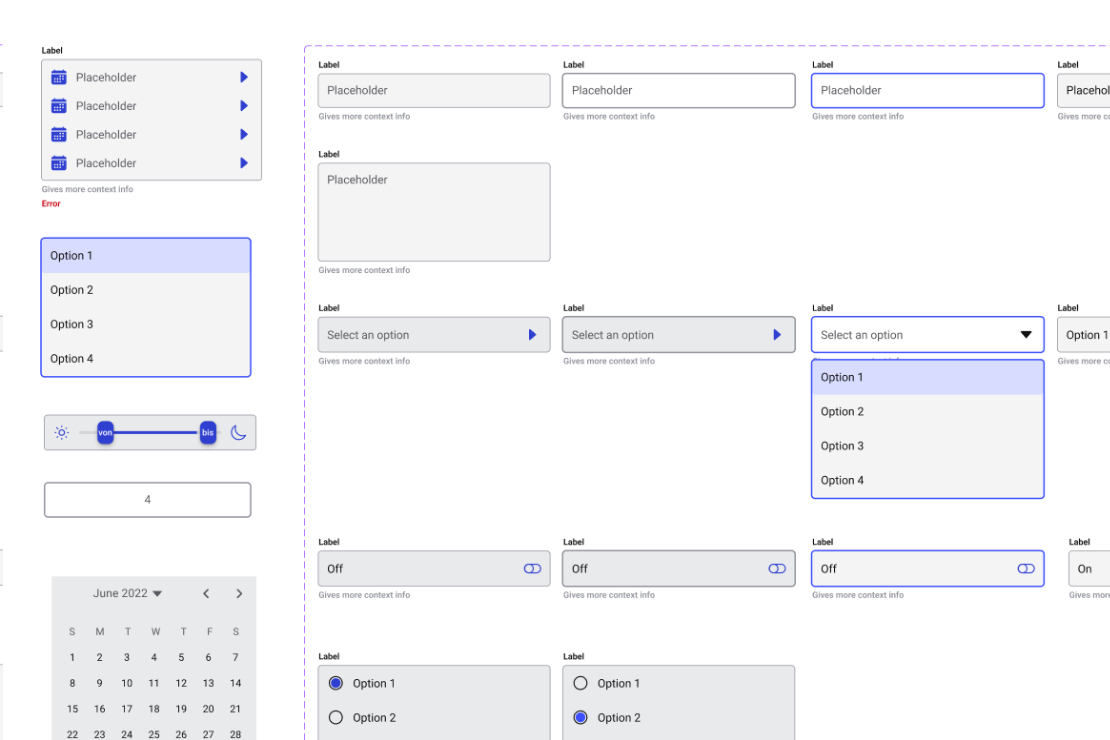
5.3 Components
As already mentioned at the beginning, the app is based on the Ionic framework, which has a basic design that depends on the respective operating system – as WPA in iOS or Android – or the respective browser. There is also the option of theming and intervening in HTML and CSS.
However, we reached the limits of the implementation in code at this point, which I will discuss in more detail elsewhere.
Based on the Figma community file “Ionic 6 Material UI Kit” (thanks to Aditya Patel), I built the components we needed in Figma.
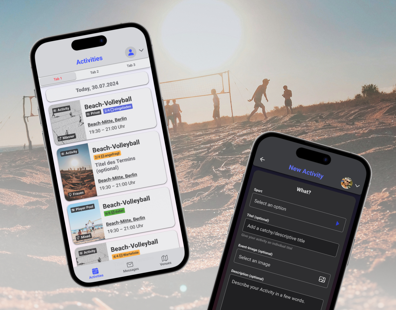
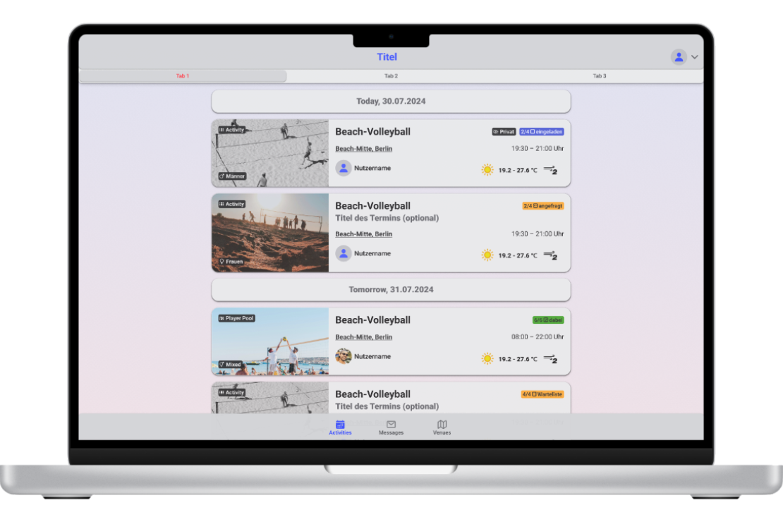
5.4 Activities overview screen (Home)
To give the visual appearance more scope, I decided to have the main segments of the content “floating” on the background and to breathe more life into them with a gentle color gradient.
A visual balance of tidiness and liveliness through color and size contrasts is important to me, as well as the possibility of customization by users in the form of self-uploaded title photos.
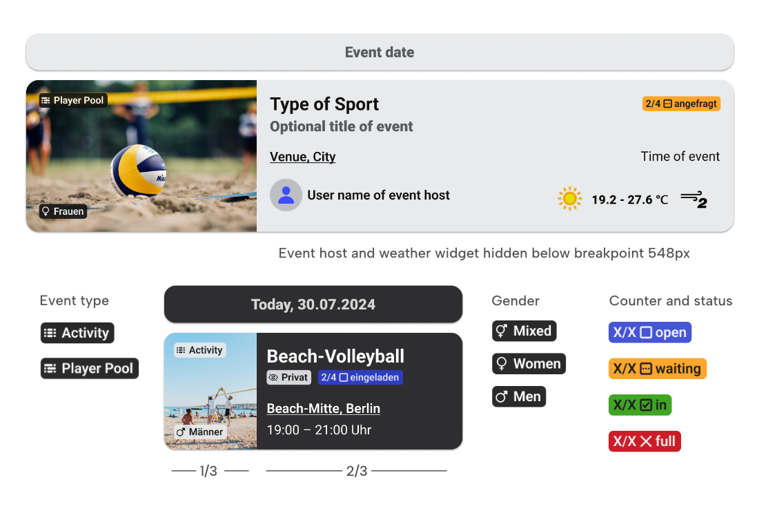
The list elements for the preview view of the available events should contain as much information as possible without becoming overloaded and confusing.
For this purpose, I have introduced different types of badges, which are quickly readable by the user through icon, text and color as features to distinguish the different event attributes.
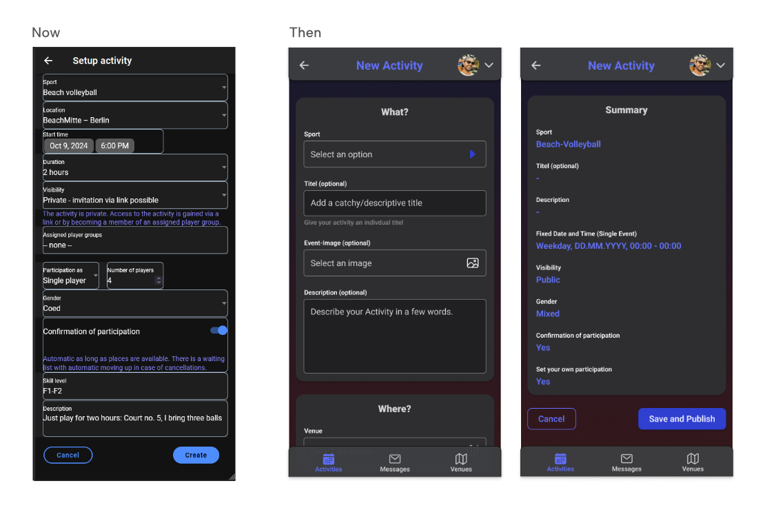
5.5 Create an event dialog
To give the visual appearance more scope, I decided to have the main segments of the content “floating” on the background and to breathe more life into them with a gentle color gradient.
A visual balance of tidiness and liveliness through color and size contrasts is important to me, as well as the possibility of customization by users in the form of self-uploaded title photos.
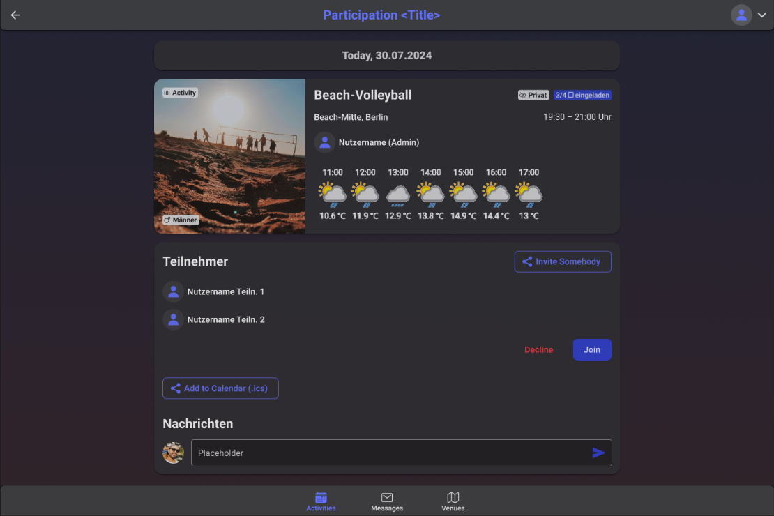
5.6 Participate in an event dialog
6. Project Conclusion
This free project, in close collaboration in a small team of two, has taught me a lot. In general, in terms of my workflow and handling, especially in depth with Figma and its functions, such as components, tokens and display options, but also the – still quite superficial – intervention in HTML and CSS code with VS code.
It has also shown me how difficult it is to intervene in existing structures that have grown over several years and that, on the one hand, technically, or in terms of the amount of work involved, but also in terms of the perception of the people involved (developers and users), you reach your limits with overly revolutionary restructuring projects and you often make progress in small steps and with sensitivity – which is probably a good thing, of course, as long as you don’t want to scare off your user base or win over a completely new user base. These are strategic issues that you need to be clear about.
Last but not least, it became clear – an aspect that is all too familiar to me from my experience in industrial design – how important the link is between design (my role in the project) and technical/functional implementation (the role of the backend developer). We both lacked in-depth knowledge of front-end or web design, the time to familiarize ourselves with this sufficiently, or the role of the front-end dev in the team.
Nevertheless, I acquired valuable new knowledge in this area and even though I am ending the project at this point due to other commitments, this does not mean that it will not continue to develop in the future with or without my active involvement.
